

Conducting User Interviews That Actually Reveal Insights
Learn how to ask the right questions, listen actively, and extract genuine user insights that guide your design decisions.
Create journey maps that communicate clearly across teams—with the right level of detail and visual hierarchy to guide design decisions.
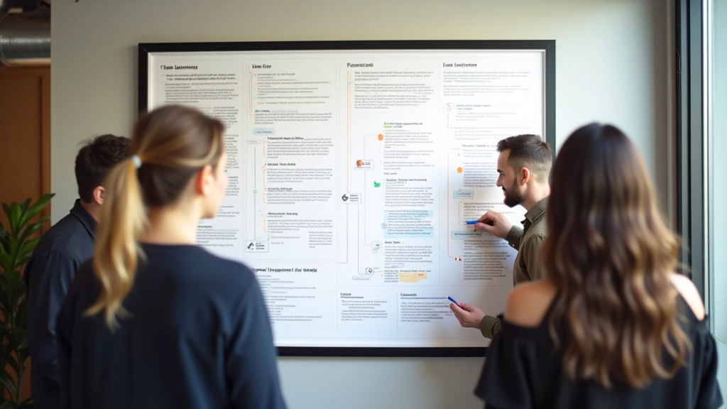
User journey maps aren't just diagrams. They're communication tools. The best ones don't try to show everything—they show what matters to your specific team right now. That's the difference between a map that gets printed and pinned on the wall, and one that gathers dust in a shared drive.
We've all seen them—massive, sprawling journey maps that attempt to capture every possible touchpoint, emotion, and pain point a user might experience. They're exhaustive. They're also exhausting. When your map has 15 columns and rows that go on for days, it stops being useful. It becomes a artifact.
The problem isn't ambition. It's clarity. A journey map that tries to answer every question ends up answering none of them well. Your product team needs to know about conversion friction. Your support team cares about complaint patterns. Your marketing folks want to understand awareness moments. You can't fit all of that equally into one visualization without losing focus.
That's why the maps that actually get used are the ones that start with a single question: "What does this team need to understand about our user?" Not everything. Not nice-to-know. What they need.

A journey map that lives in your team's workflow is worth more than a perfect map nobody looks at.
— Design principle from Vancouver UX studios
Here's what works: Start narrow. Define the user segment—not "all customers" but "first-time visitors who abandon before signup." Pick the journey stage—maybe "first 10 minutes on site." Then decide what row categories matter. Most teams need 4-6 rows: what the user's doing, what they're thinking, what they're feeling, what obstacles show up, and which team member owns each moment.
You'll notice that's not 15 rows. It's focused. It's testable. A product manager can walk into a standup with this map and say, "Here's where we lose people," and everyone sees it immediately. That clarity gets teams aligned faster than a 40-page research synthesis ever could.
The physical format matters too. Don't hide it in a Figma file. Print it. Put it on a wall. When it's visible, your team references it during decisions. When it's in a tool, it becomes historical documentation.
Layer 1 is behavior. What's the user actually doing at each stage? Be specific. Not "exploring options"—"reading product reviews" or "comparing pricing." Your team needs concrete actions they can design around.
Layer 2 is emotion and context. What's the mental state? Are they confident? Frustrated? Overwhelmed? This is where you spot moments that matter. The user might be doing the same thing (reading reviews) but their emotional state changes—first they're curious, later they're skeptical. That's a design opportunity.
Layer 3 is intervention points. Where can your product, team, or content actually influence what happens? Some moments you can't control. But others—those are where design and strategy live. Flag those. That's where your map becomes a roadmap.

The moment after you finish a journey map is critical. If you file it away, it becomes history. If you present it to the team and ask them what they see, it becomes a thinking tool. Try this: print the map. Bring it to your next product meeting. Ask three questions—what surprised you? Where do we lose people? What could we test first?
Your team will generate ideas faster with a good map in front of them. You'll argue less about what users experience because you're looking at the same thing. That's the whole point. You're not creating art. You're creating clarity.
The best journey maps aren't the most detailed. They're the ones your team actually uses. They're narrow enough to be clear, visual enough to be memorable, and specific enough to guide real decisions. Start with one user segment. One journey stage. One clear question. Then build from there. You'll be surprised how much alignment comes from seeing the same picture together.
Disclaimer: This article provides educational guidance on user journey mapping practices based on common UX research approaches. Every project and team structure is different—adapt these methods to fit your specific context and user research findings. Consult with your team and stakeholders to validate assumptions before making major design decisions.

Editorial Team
Written by the FlowMap Design Editorial Team, focused on practical UX research and prototyping guidance for Vancouver design studios.
Learn how to ask the right questions, listen actively, and extract genuine user insights that guide your design decisions.

A practical walkthrough on translating user research findings into concrete wireframes and layout decisions.

Quick techniques for building testable prototypes without spending weeks perfecting every detail.