

Conducting User Interviews That Actually Reveal Insights
Learn how to ask the right questions, listen actively, and extract genuine user insights that inform your design decisions.
A practical walkthrough on translating user research findings into concrete wireframe layouts that solve actual user problems. Learn how to bridge the gap between what you discovered and what you build.

You've spent weeks talking to users. You've filled notebooks with observations. You understand their frustrations, their goals, the moments where your product could help them. Now comes the hard part: turning all that insight into something concrete. That's where wireframes come in. They're not just pretty sketches. They're your way of saying "this is how we solve the problem we discovered." And if you're doing it right, they're solving the exact problems your research uncovered.
The jump from research to wireframes feels big because it is. You're moving from observation to design decision. But it's not a leap in the dark. It's a careful translation. Every wire you draw should have a reason rooted in what you learned.
Before you open your wireframing tool, sit with your research. Not all of it. The part that matters for design. Look for patterns. Where do users struggle? Where do they lose patience? What information do they need right now, and what can wait?
Most teams jump straight to "what should the layout look like?" But that's backwards. You're not designing layouts yet. You're designing answers. The layout comes after. It's the vehicle for the answer, not the point itself.
If your research showed that users don't understand your pricing model, your wireframe needs to answer that problem. If they're abandoning checkout because they can't see shipping costs upfront, your wireframe solves that. Every section, every button, every piece of information has a purpose rooted in what you learned.
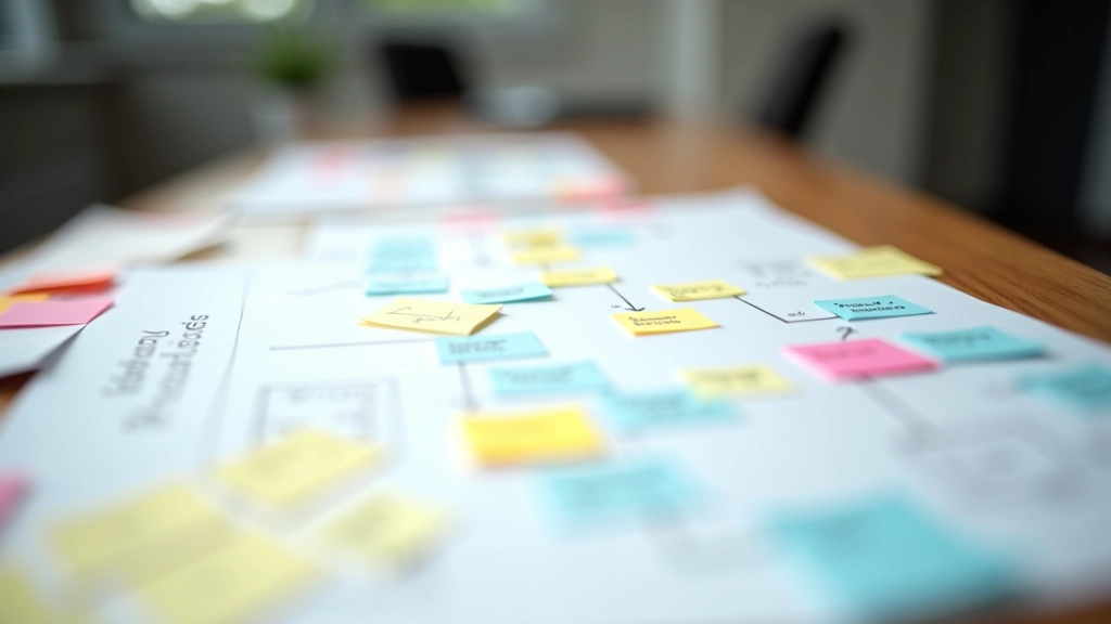
"Every wire you draw should have a reason rooted in what you learned. Otherwise you're just making layouts, not solving problems."

Wireframes don't need to be pretty. They shouldn't be. You're thinking through problems, not impressing people. Grab paper. Or use Balsamiq. Or Figma with the dumbest gray boxes you can manage. The tool doesn't matter. What matters is speed and clarity.
At this stage, you're asking: Where does this information go? What does the user see first? What's the critical path from arrival to conversion? You're not choosing fonts or debating colors. Those come later. Right now, you're mapping information architecture and task flow.
A good low-fidelity wireframe takes 30 minutes, not three days. If you're still tweaking it after an hour, you've gone too detailed. The goal is clarity, not perfection. You want to show your team the logic. You want to catch problems before anyone invests in visual design.
What does the user need to accomplish? Break it into steps. "View products" becomes "Browse category, filter by price, read reviews, compare two items." Each task gets its own wireframe or section.
Where does the user make a choice? Where do they get confused? Where does your research say they drop off? These become prominent on your wireframe. Don't hide them.
Not everything matters equally. Your research told you what users care about. Put that above the fold. Bury the nice-to-haves. Information hierarchy is a design decision, and it's rooted in research.
Users hesitate when they're unsure. Add clarity at those moments. Trust badges where they doubt. Explanations where they're confused. Undo buttons where they fear mistakes. These aren't nice extras. They're solutions to problems you found.
Walk through your wireframe like a user. Does the flow match what you discovered? Can someone accomplish the task without confusion? If your wireframe doesn't solve the problems your research found, start over.
The biggest mistake? Forgetting your research the moment you open Figma. You've got all this insight, and suddenly you're making decisions based on "what looks good" or "what competitors do." That's not design. That's decoration.
You'll also be tempted to show too much. Every feature. Every nice-to-have. Every idea from the brainstorm. But your wireframe isn't the place for that. It's focused. It solves the core problems. Everything else is noise.
And here's the one nobody talks about: you'll make wireframes that are technically correct but emotionally cold. You've solved the functional problem. But the user still feels frustrated or lost. That's because you didn't wire in the human part. The reassurance. The celebration. The moment where they know they're doing it right.

When you do this right, something shifts. Your team looks at your wireframes and they don't say "that looks nice." They say "I see exactly what the user is trying to do and how we're helping them do it." That's the signal that you've made the jump successfully. You're not guessing anymore. You're designing from evidence.
The research doesn't end when you start wireframing. It informs every choice you make. Layout, information order, interaction patterns—they're all rooted in what you learned. And that's what separates good design from decoration. Good design solves problems. And you can only solve problems you understand.

Editorial Team
Written by the FlowMap Design Editorial Team, focused on practical UX research and prototyping guidance for Vancouver design studios. We share what actually works.
Learn how to ask the right questions, listen actively, and extract genuine user insights that inform your design decisions.
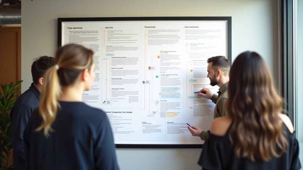
Create journey maps that communicate clearly across teams—with the right level of detail to guide design decisions.
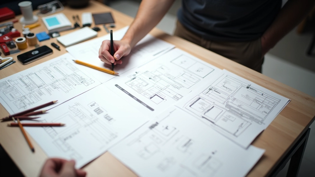
Quick techniques for building testable prototypes without spending weeks perfecting details.
This guide shares practical approaches to wireframing based on UX research principles. Every project is different, and what works depends on your specific users, business goals, and constraints. We recommend testing these approaches with your team and adapting them to fit your context. Design decisions should always be validated through user research and testing rather than assumptions alone.